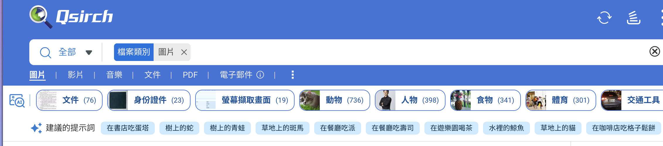
Recently, when using Qsirch to search for images, as soon as I enter the image search results page, I see a whole row of suggested keywords at the top of the screen, similar to tags. However, at first, I didn’t really understand what these words were supposed to help me with, nor was I sure how they related to the results I was seeing, so they actually distracted me and made the page feel crowded.
My thoughts are:
- Suggestion keywords should only appear when I click on the input box
This way, it’s clear that the system is “helping me supplement/extend my search content,” rather than just throwing a row of words at me as soon as I open the page, which would make the context clearer.
- The position could be closer to the input box
Right now, it feels a bit disconnected, almost like it’s a separate, unrelated area. If it could appear attached to the input box (for example, expanding below the input box) and visually tied to “what I’m typing,” it would feel more intuitive.
There’s no need to show so many suggestions in a row—just 3 or 4 that are “really relevant” would be enough. When I use it, I don’t actually look through all the suggestions one by one; it feels more like a “feature showcase” rather than actually “helping me find what I want faster.” If you change it to a small number of precise suggestions that are highly relevant to my current search, they’re more likely to actually be clicked.
Additionally, above the suggestion keywords, there’s also a row of outline-style buttons with image AI icons. From what I can tell, they seem to be related to “objects in the image,” but since there’s already a filter on the right, that whole row of buttons feels a bit redundant to me. At first glance, it’s also not clear what they’re for, which is confusing.
If the functions of these buttons are actually similar to the filters on the right, or just another way of displaying them, I’d prefer not to have another whole row placed on the images, otherwise the results page becomes even more complicated and overloaded with information.